Innovation Lab Use Case
EIS Fire - Interactive data visualization
Fire related activities are visualized through Jupyter notebooks utilizing data stored on Amazon S3 buckets, as well as EC2 node clusters along with DaskHub services for JupyterHub.
The interactive dashboard displays raster data in an interactive time series format. This raster data may be clipped to individual states via user-controls. In addition, the dashboard displays various time-series of user-given data products. These time-series are averaged over individual state polygons.
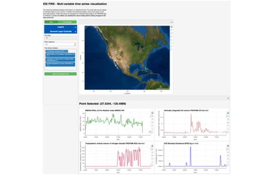
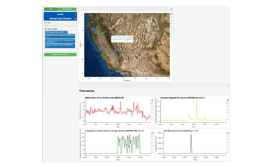
All TROPOMI data is unfiltered L2 gridded data.